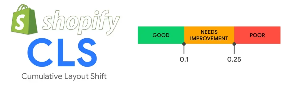
Cumulative Layout Shift (CLS) is a metric used to measure the visual stability of a web page. It refers to the unexpected movement of elements on a web page as it loads or during user interaction. This movement can be caused by a variety of factors such as images and iframes without specified dimensions, late-loading content, third-party scripts, or CSS animations and transitions. CLS is measured by calculating the impact fraction, which is the product of the distance an element moves and the percentage of the viewport it occupies. A lower CLS score means a more visually stable web page.
CLS is an important metric to consider for several reasons. First, it can negatively impact user experience, causing frustration and confusion as users try to interact with a moving web page. Second, it can affect SEO rankings, as Google considers visual stability to be an important factor in page experience. Websites with high CLS scores may be penalized in search rankings. Finally, CLS can also impact ad revenue, as ads that shift position or overlap with other elements may not be as effective.
Fortunately, there are several strategies for fixing CLS issues in Shopify and improving the visual stability of your website. In this post, we have covered several ways to fix CLS in Shopify.
- Images or videos without dimensions
- Ads or iframes
- Font loading
- Dynamic content
- Third-party scripts
- Responsive design
- Lazy loading
- Web fonts
- CSS animations or transitions
- Test and monitor
- Conclusion
Images or videos without dimensions
To fix Cumulative Layout Shift issues in Shopify, one effective strategy is to specify image dimensions in the HTML or CSS. This allows the browser to reserve space for the image before it loads, reducing the likelihood of a shift.
Here are some steps to follow to specify image dimensions in Shopify:
- Determine the dimensions of your images: Before you can specify dimensions, you need to know what they are. Check the image file itself or your image editing software for the dimensions.
- Add dimensions to the HTML or CSS: Once you have the dimensions, you can add them to your HTML or CSS. In Shopify, the easiest way to do this is to modify the liquid code that generates the image tag.
For example, let’s say you have an image with a width of 1000 pixels and a height of 500 pixels. In the liquid code, you would add the dimensions like this:{% assign image = product.featured_image %} <img src="{{ image.src | img_url: '1024x1024' }}" alt="{{ image.alt }}" width="1000" height="500">
In this code, we’re using the width and height attributes to specify the dimensions of the image. We’re also using Shopify’s img_url filter to generate a URL for the image that is no larger than 1024 pixels on either side. - Repeat for all images: To ensure that all images have dimensions specified, you’ll need to repeat this process for each one. This includes product images, collection images, and any other images on your site.
Ads or iframes
When an ad or iframe loads, it can push other elements on the page down or to the side, causing a shift that can negatively impact the user experience. In this blog post, we’ll discuss some strategies for fixing ad and iframe CLS issues in Shopify.
- Specify dimensions: Just as with images, specifying the dimensions of ads or iframes can help the browser reserve space for them, reducing the likelihood of a shift. To specify dimensions, you’ll need to modify the HTML or CSS that generates the ad or iframe tag. For example, let’s say you have an iframe that is 300 pixels wide and 250 pixels high. You would add the dimensions like this:
By adding the width and height attributes, you’re telling the browser how much space to reserve for the iframe before it loads.<iframe src="https://voxfa.com" width="300" height="250"></iframe> - Load ads and iframes asynchronously: Another strategy for reducing CLS with ads or iframes is to load them asynchronously. This means that the ad or iframe will load separately from the rest of the page, allowing the other elements to load and settle into place before the ad or iframe appears. To do this in Shopify, you can use a tool like LazyLoad or a custom script to load the ad or iframe asynchronously.
- Use a placeholder: If you’re unable to specify dimensions or load the ad or iframe asynchronously, you can use a placeholder image or text to reserve space for the ad or iframe. This can reduce the likelihood of a shift and improve the user experience. To do this in Shopify, you’ll need to modify the HTML or CSS that generates the ad or iframe tag. For example, let’s say you have an ad that is 300 pixels wide and 250 pixels high. You would add a placeholder like this:
In this code, we’re using a div element with a background color to create a placeholder that is 300 pixels wide and 250 pixels high. We’re then loading the iframe after the placeholder, which will appear in the reserved space.<div style="width: 300px; height: 250px; background-color: #eee;"></div> <iframe src="https://voxfa.com"></iframe>
Font Loading
Font loading Cumulative Layout Shift (CLS) can be a frustrating issue for Shopify store owners. When fonts don’t load quickly enough, the text on your page can appear to jump around, causing a poor user experience. In this section, we’ll discuss some strategies for fixing font loading CLS issues in Shopify.
- Optimize font loading: One of the most effective ways to reduce font loading CLS is to optimize how your fonts are loaded on your site. There are several strategies you can use to do this, including:
- Preloading fonts: By preloading fonts, you can ensure that they are loaded and ready to use as soon as they are needed. To preload fonts, you can add the preload attribute to your font CSS, like this:
<link rel="preload" href="yourfont.woff2" as="font" type="font/woff2" crossorigin>
- Using font-display: The font-display property allows you to control how fonts are displayed while they are loading. By setting font-display: swap, the browser will immediately display a fallback font while the desired font is loading. Once the desired font is loaded, it will replace the fallback font seamlessly.
@font-face {
  font-family: 'YourFont';

  src: url('yourfont.woff2') format('woff2');

  font-display: swap;

} - Minimizing font size: Large font files can take longer to load, which can contribute to CLS issues. To reduce font loading times, consider minimizing the size of your font files. You can use a tool like Font Squirrel to compress your font files without sacrificing quality.
- Preloading fonts: By preloading fonts, you can ensure that they are loaded and ready to use as soon as they are needed. To preload fonts, you can add the preload attribute to your font CSS, like this:
- Set font size and line height: Another strategy for reducing font loading CLS is to set the font size and line height in your CSS. This will ensure that the text on your page has a fixed size and won’t jump around as fonts load. For example:
body {

  font-size: 16px;

  line-height: 1.5;

} - Use system fonts: If you’re still having issues with font loading CLS, you can consider using system fonts instead of custom fonts. System fonts are pre-installed on most devices, so they don’t need to be downloaded, which can improve loading times and reduce CLS. To use system fonts, you can add them to your CSS like this:
body {
   font-family: -apple-system, BlinkMacSystemFont, "Segoe UI", Roboto, Helvetica, Arial, sans-serif, "Apple Color Emoji", "Segoe UI Emoji", "Segoe UI Symbol";
 }
Dynamic content
Dynamic content, such as images or videos that are loaded asynchronously or elements that are added to the page via JavaScript, can contribute to Cumulative Layout Shift (CLS) on your Shopify store. When these elements are not properly accounted for, they can cause layout shifts that can be frustrating for your visitors. In this section, we’ll discuss some strategies for fixing dynamic content CLS issues in Shopify.
- Set size attributes: One of the most effective ways to fix CLS caused by dynamic content is to set size attributes for your images and videos. By setting width and height attributes, you can reserve the appropriate space for these elements on your page, even before they are fully loaded. For example:
<img src="yourimage.jpg" alt="Your Image" width="600" height="400"> <video src="yourvideo.mp4" width="600" height="400" controls></video> - Lazy load images: Another strategy for reducing dynamic content CLS is to implement lazy loading for your images. This means that images are only loaded when they are about to come into view, which can improve loading times and reduce the likelihood of a shift. There are several Shopify apps that can help you implement lazy loading, such as Lazy Loading by SIO or Lazy Loading Images by Pixc.
- Avoid resizing content: Resizing content dynamically can cause layout shifts, so it’s best to avoid doing so whenever possible. If you need to resize content, try to reserve the appropriate space for the content beforehand or use CSS transforms to animate the resizing.
- Preload resources: If you are loading dynamic content via JavaScript, you can improve the user experience by preloading the necessary resources beforehand. This can include images, videos, or even fonts that are used in your dynamic content. To preload resources, you can use the
preloadattribute in your HTML, like this:<link rel="preload" href="yourvideo.mp4" as="video">
Third-party scripts
Third-party scripts, such as those for analytics or social media widgets, can contribute to Cumulative Layout Shift (CLS) on your Shopify store. These scripts may load asynchronously, causing layout shifts as they load and render on your page. In this section, we’ll discuss some strategies for fixing third-party script CLS issues in Shopify.
- Defer non-critical scripts: One of the most effective ways to fix CLS caused by third-party scripts is to defer non-critical scripts. By deferring scripts that are not essential to the initial rendering of your page, you can reduce the likelihood of a layout shift. You can use the
deferattribute in your script tags to defer their loading until after the page has loaded:<script src="yourscript.js" defer></script>
- Use
asyncfor critical scripts: For scripts that are critical to the initial rendering of your page, you can use theasyncattribute instead ofdefer. This will allow the script to load asynchronously, but it will not block the rendering of your page. However, keep in mind that usingasynccan also cause other issues, such as scripts executing out of order or conflicts with other scripts on your page. - Load scripts in the footer: Another strategy for reducing third-party script CLS is to load scripts in the footer of your page. This allows the scripts to load after the main content has rendered, reducing the likelihood of a layout shift. However, be careful not to load scripts that are essential to the rendering of your page in the footer, as this can cause other issues.
- Monitor and audit third-party scripts: It’s important to monitor and audit the third-party scripts that you use on your Shopify store regularly. Make sure that the scripts you use are necessary and optimized, and consider removing any that are not essential to the functionality of your site. You can use tools like Google Tag Manager or Shopify’s built-in analytics to help you manage your scripts.
- Optimize scripts for performance: Finally, make sure that any third-party scripts you use are optimized for performance. This can include minifying scripts, reducing the number of requests, and using CDNs to improve loading times. You can also use tools like GTmetrix or Pingdom to identify any performance issues with your scripts and optimize them accordingly.
Responsive Design
Having a responsive design is crucial for any Shopify store, as it ensures that your site looks great and functions well across different devices and screen sizes. However, if not implemented properly, a bad responsive design can cause Cumulative Layout Shift (CLS) issues that can negatively impact your user experience and SEO rankings. In this section, we’ll discuss some strategies for fixing bad responsive design CLS issues in Shopify.
- Use a responsive design framework: Using a responsive design framework like Bootstrap or Foundation can help ensure that your Shopify store’s design is responsive and mobile-friendly. These frameworks provide a solid foundation for building responsive designs and have been tested extensively, ensuring that they work well across a range of devices and screen sizes.
- Test your design across different devices: Testing your design across different devices and screen sizes is essential to identifying any CLS issues that may arise due to bad responsive design. You can use tools like BrowserStack or Responsive Design Checker to test your site’s responsiveness and identify any layout shift issues.
- Avoid fixed-width elements: Using fixed-width elements can cause CLS issues on your site, as they may not scale properly across different devices and screen sizes. Instead, use fluid or responsive elements that adjust based on the size of the viewport. This will help ensure that your site’s design remains consistent and stable across different devices.
- Use CSS media queries: CSS media queries allow you to apply different styles to your site based on the size of the viewport. This can help ensure that your site’s design is optimized for different devices and screen sizes, reducing the likelihood of CLS issues. Make sure to test your site thoroughly across different devices to ensure that your media queries are working as intended.
- Minimize unnecessary design elements: Finally, it’s important to minimize unnecessary design elements on your site to reduce the likelihood of CLS issues. This includes things like animations, background images, and unnecessary widgets or plugins. By simplifying your site’s design, you can reduce the risk of layout shifts and improve the user experience for your visitors.
Lazy loading
Lazy loading is a popular technique used by many Shopify stores to improve page load times and reduce the amount of data transferred to the user’s browser. However, if not implemented properly, lazy loading can contribute to Cumulative Layout Shift (CLS) issues that can negatively impact your user experience and SEO rankings. In this section, we’ll discuss some strategies for fixing lazy loading CLS issues in Shopify.
- Implement Intersection Observer API: The Intersection Observer API is a modern JavaScript API that can be used to implement lazy loading in a way that doesn’t cause CLS issues. The Intersection Observer API allows you to detect when an element enters or exits the viewport, and trigger the loading of an image or other content accordingly. By using this API, you can ensure that lazy loading doesn’t cause layout shifts on your Shopify store.
- Specify image dimensions: One of the primary causes of CLS issues with lazy loading is the lack of specified image dimensions. When an image is loaded lazily, the browser may not know the dimensions of the image until it has loaded, causing a layout shift. By specifying the image dimensions in the HTML, you can ensure that the browser knows the dimensions of the image before it is loaded, preventing layout shifts.
- Preload critical resources: Preloading critical resources like fonts, CSS, and JavaScript can help ensure that they are loaded before the content that depends on them is rendered. This can reduce the likelihood of CLS issues with lazy loading, as the resources that are required for rendering are loaded before the content is displayed.
- Avoid loading content too far down the page: Loading content too far down the page can cause CLS issues with lazy loading, as the content that is loaded may push the existing content down, causing a layout shift. Instead, load the content as close to the top of the page as possible to reduce the likelihood of CLS issues.
- Use a placeholder image: Using a placeholder image can help ensure that the space where the lazy loaded image will be displayed is reserved, preventing layout shifts. The placeholder image should be the same size as the lazy loaded image to ensure that the space is reserved properly.
Web Fonts
Web fonts are an essential element of modern web design, but they can also contribute to Cumulative Layout Shift (CLS) issues that can negatively impact your Shopify store’s user experience and SEO rankings. In this blog post, we’ll explore some strategies for fixing web font CLS issues in Shopify.
- Use font-display: The font-display property is a CSS property that can be used to control how a font is displayed while it is being loaded. By setting the font-display property to “swap”, you can ensure that a fallback font is displayed immediately while the web font is being loaded. This can prevent layout shifts caused by web fonts.
- Load web fonts asynchronously: Loading web fonts asynchronously can help ensure that they don’t block the rendering of the rest of the page. By using the Web Font Loader library or other asynchronous loading techniques, you can ensure that web fonts are loaded without causing layout shifts.
- Preload web fonts: Preloading web fonts can help ensure that they are loaded before they are needed, reducing the likelihood of layout shifts. By adding a preload link to your HTML, you can instruct the browser to download the web font as soon as possible.
- Specify font size and line height: When using web fonts, it’s important to specify the font size and line height in the CSS. This can help ensure that the space required for the web font is reserved before it is loaded, preventing layout shifts.
- Use system fonts: In some cases, using system fonts instead of web fonts can help prevent CLS issues. System fonts are installed on the user’s device and can be loaded quickly, reducing the likelihood of layout shifts.
CSS animations and transitions
CSS animations and transitions can add a lot of visual interest to your Shopify store, but they can also cause Cumulative Layout Shift (CLS) issues that can negatively impact your site’s user experience and SEO rankings. In this blog post, we’ll explore some strategies for fixing CSS animation and transition CLS issues in Shopify.
- Use animation-fill-mode: The animation-fill-mode property is a CSS property that controls what happens before and after an animation is executed. By setting the animation-fill-mode property to “forwards”, you can ensure that the final state of an animation is maintained even after it has finished executing. This can prevent layout shifts caused by CSS animations.
- Set fixed dimensions: When using CSS animations, it’s important to specify fixed dimensions for the elements being animated. This can help ensure that the space required for the animation is reserved before it is executed, preventing layout shifts.
- Use transform instead of position: When animating an element’s position, it can cause layout shifts as the element moves across the screen. By using the transform property instead, you can move the element without affecting its position in the layout, preventing layout shifts.
- Use will-change: The will-change property is a CSS property that can be used to inform the browser that an element is going to change in a specific way. By using the will-change property, you can allow the browser to optimize the rendering of the element and prevent layout shifts.
- Use requestAnimationFrame: The requestAnimationFrame API can be used to schedule animations in a way that minimizes layout shifts. By using requestAnimationFrame to schedule animations, you can ensure that they are executed at the optimal time, reducing the likelihood of layout shifts.
Test and monitor
As with any optimization, it’s important to test and monitor your site regularly for any remaining CLS issues. Use tools like Lighthouse or Google PageSpeed Insights to identify any remaining issues and continue optimizing your site.

Conclusion
In conclusion, CLS is a critical metric that website owners must optimize for to improve user experience, SEO rankings, and ad revenue. By implementing these strategies, you can fix CLS issues on your Shopify store, ensuring a more stable and visually pleasing experience for your users.
If you’re struggling with fixing Cumulative Layout Shift issues on your Shopify store, don’t worry – Voxfa can help. We have a team of experienced web developers who specialize in optimizing websites for performance, including CLS. We can perform a thorough audit of your Shopify store to identify any CLS issues and implement the necessary fixes. We can also provide ongoing maintenance and support to ensure that your store remains optimized for CLS and other performance metrics. Don’t let CLS affect your user experience, SEO rankings, and ad revenue – reach out to us for expert help today.